http://my.ilstu.edu/~jrcarter/Geo204/Choro/Tom/
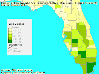
This map is an example of a classed choropleth map. Here,
the map data is set up into classes that allow us to see differences around the
state. The various regions are colored based on the class in which they fall
in. The map above looks at the amount of Hispanic people living in Florida by
percent. The classes are set up equally so that the data can be portrayed
correctly. The deeper greens, according to the legend, show us a higher
percent. Classed choropleth maps are handy ways to look at a large amount of
data in a small space.

No comments:
Post a Comment